

Think a webhook icon is just a tiny image? Think again.
If your UI, docs, or architecture diagrams need a clear event symbol, a bad icon costs time and causes confusion.
This post gives immediate access to free webhook icon downloads in SVG and PNG.
You’ll get scalable SVGs for high-res displays, ready-to-use PNGs at common sizes, color and monochrome variants, and plain licensing notes so you can drop assets into a repo or CDN in minutes.
Immediate Access to Webhook Icon Downloads and Formats

Developers and designers building event-driven systems need webhook icons that drop straight into UIs, documentation, and architecture diagrams without detours. The OpenWeb Icons Set offers free webhook icons in both Black & White and Color variants, all released under the SIL Open Font License 1.1. The black and white icon ships as a solid, easy to recolor graphic that adapts to any brand palette in seconds.
Webhook SVG files scale infinitely without quality loss. Perfect for high resolution displays, print exports, and responsive layouts. PNG downloads come pre-rendered at common sizes (16px, 24px, 32px, 48px, and 64px) ready for quick img tags or toolbar assets. ICO files serve legacy Windows environments and favicon slots. Icon fonts package the webhook glyph alongside other symbols for CSS class based rendering, and sprite sheets let you batch load multiple icons in a single HTTP request.
Downloadable asset types include:
- SVG files – editable vectors for Figma, Sketch, Illustrator, or inline HTML embedding
- PNG exports – raster images at 16, 24, 32, 48, 64, 128, 256, and 512 pixel dimensions
- ICO format – Windows icon container for desktop and legacy tooling
- Icon fonts – WOFF/TTF packages with CSS class mappings for icon font workflows
- Zip bundles – combined packs with all sizes, formats, and color variants in one archive
- Sprite sheets – single SVG files containing multiple icons, optimized for front end performance
Two distribution paths exist. An open source library delivers the icons at no cost with attribution requirements under SIL OFL 1.1. And a paid hosted solution offers a generous free tier for teams needing managed asset delivery and automatic format conversions. Both routes give you production ready webhook icons within minutes.
Webhook Icon Style Variations and Visual Characteristics
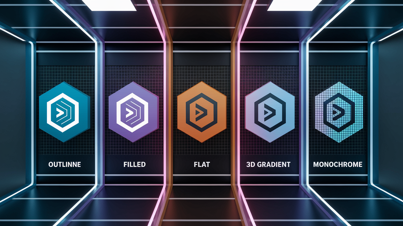
Webhook icons appear in multiple design styles to match different UI frameworks and documentation themes. Outline icons use thin strokes around a hollow center, fitting minimal dashboards and light mode interfaces. Filled variants render the webhook shape as a solid mass, offering higher contrast in toolbars, sidebars, and dark mode layouts. Flat designs strip away gradients and shadows, aligning with modern card based UIs and Material Design guidelines. 3D and gradient versions add depth through subtle shading or color transitions, useful in marketing pages, onboarding screens, and presentation decks.
The solid black and white icon is described as easy to recolor. Drop it into your design tool, select the path, and apply any hex or HSL value. Color variants ship with predefined palettes, often blue or purple to signal API activity, but you can override fills just as easily. Material Design Icons offers subsets such as MDI Light, which reduces stroke weight for high density layouts, and Memory Icons, which leans into a playful, retro pixel aesthetic.
Common style categories include:
- Outline / line – minimal strokes, lightweight, clean
- Filled / solid – high contrast, easy to spot in dense UIs
- Flat – no shadows or gradients, ideal for modern card layouts
- 3D / gradient – adds depth for marketing materials and onboarding flows
- Monochrome – single color versions for rebranding or theming at scale
Switching between these styles is often as simple as downloading a different file variant or toggling a CSS class if you’re using an icon font workflow.
Webhook Icon Licensing, Compliance, and Commercial Use
Icons from the OpenWeb Icons Set ship under the SIL Open Font License 1.1, which permits commercial use, modification, and redistribution as long as you include the original license file and don’t rename the font package if you’re distributing it as a standalone font. Attribution in the UI itself isn’t required, but the license file must accompany any redistribution. Drop it in your repo’s LICENSE or THIRDPARTYNOTICES file.
Commercial teams can use the icons in SaaS dashboards, internal tools, and client facing products without per seat fees. If you customize the SVG and bundle it into a design system, you’re free to do so. The hosted solution mentioned in distribution options operates under a proprietary license for its managed CDN and conversion APIs, but the underlying icon assets remain open.
When evaluating icon libraries, compare license terms to understand usage scope:
| License Type | Key Permissions | Attribution Needed | Commercial Use |
|---|---|---|---|
| SIL OFL 1.1 | Use, modify, redistribute; include license file | License file in repo or dist package | Yes |
| MIT | Use, modify, redistribute; include copyright notice | Notice in source or docs | Yes |
| CC BY 4.0 | Use, modify, share; credit creator and link to license | Visible attribution in UI or docs | Yes |
| Proprietary | Defined by vendor; often single project or seat limited | Varies | Check vendor terms |
For asset management at scale, store the license alongside your icon library in version control and update your design system docs with usage guidance. If you’re packaging icons in a white labeled product, confirm whether redistribution clauses apply and whether you need to surface license details to end users.
Webhook Icon Integration in UI and Documentation Workflows
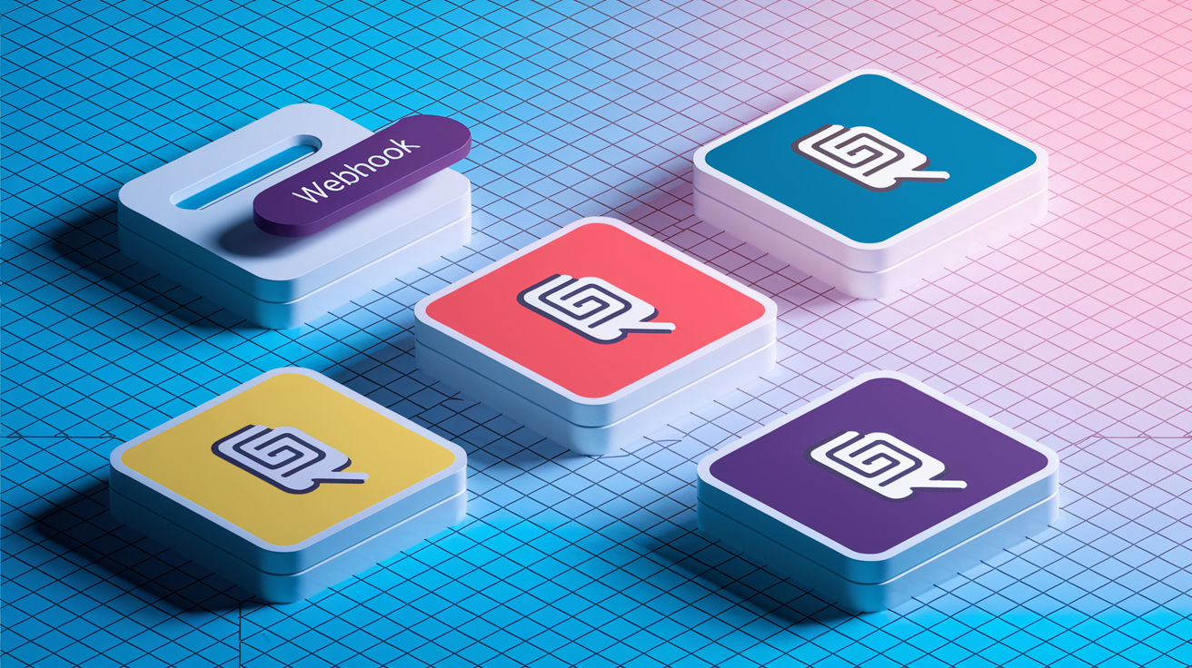
Webhook icons signal event driven actions across software interfaces and technical documentation. In dashboards, the icon anchors a “Webhooks” menu item or a configuration card where users manage endpoint URLs, secret keys, and retry policies. Toolbars use the icon as a quick shortcut to open webhook logs or test payloads. Sidebars display it next to integration lists, differentiating webhook based flows from polling or batch imports.
Alert banners and notification toasts render the webhook icon alongside messages like “Webhook delivery failed. Check endpoint availability.” Integration diagrams in architecture docs place the icon between boxes labeled “Your App” and “External Service” to illustrate event flow. Tutorial illustrations use the icon to mark steps where the system dispatches an HTTP POST to a remote URL, helping readers trace data movement visually.
Real world placements include:
- Action buttons – “Configure Webhook” or “Test Endpoint” CTAs in settings panels
- Toolbar shortcuts – one click access to webhook logs or delivery dashboards
- Sidebar navigation – a dedicated menu entry for webhook management
- Alert banners – status indicators showing successful delivery or retry attempts
- System diagrams – flow charts in API docs explaining event driven architecture
The black and white style adapts to UI theming by accepting fill or stroke overrides, so you can match brand colors without generating new assets. Color variants work when you want the icon to stand out or signal a specific state. Blue for active, gray for disabled, red for failed deliveries.
Customizing and Editing Webhook Icons (SVG, Color, Stroke)

SVG files open in vector editors like Adobe Illustrator, Figma, or Inkscape, exposing every path node for adjustment. To change the icon color, select the shape layer and apply a new fill or stroke hex value. If your design system requires a lighter weight, reduce the stroke width from the default (often 2px) down to 1.5px or 1px. For higher contrast, bump it to 2.5px or 3px. Export settings let you choose PNG sizes by entering pixel dimensions or SVG output with optimized paths and stripped metadata.
Figma components let you build a reusable webhook icon that inherits color tokens from your design system. Drop the SVG into a frame, convert it to a component, and attach color styles to fill properties. When the brand palette updates, every instance recolors automatically. Sketch symbols work the same way. Nest the icon inside a symbol, override the fill in the layer panel, and propagate changes across all artboards.
Common customization tasks include:
- Stroke width adjustments – dial weight up or down to match UI density and line art style
- Color palette edits – swap fills or strokes to align with brand guidelines or theme modes
- Exporting PNG sizes – batch export at 16, 24, 32, 48, 64, 128, 256 px for asset catalogs
- Optimizing SVG output – run SVGO or Figma’s “Outline Stroke” to reduce file size and rendering quirks
- Designing hover states – duplicate the icon, adjust opacity or color, and wire to CSS transitions
- Adapting for dark mode – invert fills or apply lighter strokes for visibility on dark backgrounds
Most tools let you copy the SVG markup directly from the canvas, so you can paste it inline into HTML templates or React components without touching the file system.
Using Webhook Icons from Material Design Icons and Other Libraries
Material Design Icons organizes the webhook symbol under “Icons & Fonts,” bundling it alongside thousands of glyphs for drop in use. MDI Light strips down stroke weight for interfaces that favor delicate line art, while Memory Icons leans into a pixel art aesthetic for retro or playful dashboards. Each library provides the same webhook concept but adjusts visual treatment to match its design philosophy.
Icon fonts package the webhook glyph as a single Unicode character, letting you reference it with a CSS class like .mdi-webhook. SVG sprite sheets bundle multiple icons into one file, and you reference individual shapes with <use xlink:href="#webhook">. Inline SVG embeds the full markup in your HTML, giving you CSS control over fills and strokes without external file dependencies.
| Library | Style Variant | Format Types | Notes |
|---|---|---|---|
| Material Design Icons | Filled, Outlined, Rounded, Sharp, Two Tone | SVG, icon font, sprite | 5 style families, 7,000+ icons total |
| MDI Light | Thin outline | SVG, icon font | Reduced stroke weight for high density UIs |
| Memory Icons | Pixel / retro | SVG, PNG | Nostalgic 8 bit aesthetic |
| Generic Icon Font Set | Mixed | WOFF, TTF, SVG font | Self hosted or CDN delivered |
CSS class usage looks like <i class="mdi mdi-webhook"></i> when you load the MDI font file. Inline SVG usage drops the full vector markup into your component. <svg><path d="..." fill="currentColor"/></svg> lets the icon inherit text color from surrounding CSS. Sprite workflows load one master SVG file and stamp out instances with <svg><use href="icons.svg#webhook"></use></svg>, reducing HTTP requests and speeding up page loads.
Footer links on the MDI page include Contact Us, Privacy Policy, and Code of Conduct, signaling active governance and community support. The 2025 copyright year confirms recent maintenance.
Accessibility Requirements for Webhook Icons
Icons without text labels become invisible to screen readers unless you add semantic markup. When the webhook icon decorates a button or link, include aria-label="Configure webhook endpoint" so assistive tech announces the action. If the icon is purely decorative and adjacent to visible text, apply aria-hidden="true" to prevent redundant announcements. “Webhooks Webhooks” confuses users.
Alt text on <img> tags should describe intent, not appearance. Instead of “webhook icon,” write “Webhook configuration” or “Event delivery settings.” For inline SVG, nest a <title> element at the top of the markup. <svg><title>Webhook settings</title><path.../></svg> and link it with aria-labelledby if you need more control.
Accessibility checklist:
- Alt text – describe function, not visual detail (“Webhook settings” not “curved arrow icon”)
- Aria label – attach to interactive elements when no visible text exists
- Color contrast – ensure icon and background meet WCAG AA (4.5:1 for small text, 3:1 for large UI elements)
- Keyboard reach – if the icon triggers an action, make the parent element focusable and keyboard navigable
Run contrast checker tools on icon fills against background colors. If your webhook icon is light gray on white, bump it to a darker shade or add a stroke. Dark mode requires the inverse check. Light icons on dark backgrounds need enough luminance to remain legible.
Implementation Snippets for Webhook Icons in HTML, CSS, and React

Inline SVG embeds the full vector markup directly in your HTML, letting you style fills and strokes with CSS. Paste the SVG code into your template, remove width and height attributes to make it responsive, and apply fill="currentColor" so the icon inherits text color from the parent element. Example: <svg viewBox="0 0 24 24" fill="currentColor"><path d="M10 ..."/></svg>. This approach eliminates HTTP requests and gives you instant control over hover states and animations.
Image tag usage loads the SVG or PNG as an external file. <img src="/icons/webhook.svg" alt="Webhook configuration" width="24" height="24">. This method caches the asset across pages and keeps markup clean, but you lose CSS fill control unless you inline the SVG or use CSS filters (which can get messy). For React components, wrap the SVG in a function component and accept props like color and size. <WebhookIcon color="#1a73e8" size={24} />. Inside the component, interpolate props into the SVG’s fill and viewBox.
Steps for embedding icons responsibly:
- Choose inline SVG for single use, theme aware icons where CSS styling matters
- Use
<img>tags for reusable assets that don’t need color overrides - Build React/Vue components when you need programmatic size or color control
- Apply
aria-labeloraria-hiddendepending on whether the icon is interactive or decorative - Test keyboard navigation and screen reader output in your target browsers and assistive tools
CSS transitions smooth hover effects. .webhook-icon { transition: fill 0.2s; } and .webhook-icon:hover { fill: #1a73e8; }. Animations can rotate the icon on click or pulse it during webhook retries, signaling activity without interrupting the user’s flow.
Related API and Integration Icons for Complete Workflow Diagrams

Webhook icons rarely stand alone in system diagrams. Pair them with API endpoint symbols (a node or server box), event trigger graphics (a lightning bolt or clock), server illustrations (a rack or cloud shape), payload icons (an envelope or JSON brace), and integration connectors (arrows or dotted lines). These symbols combine to map data flow from a source system through a webhook dispatcher to a remote endpoint, then back to your app via callback or status polling.
Architecture docs benefit from consistent iconography. When every webhook uses the same glyph and every API call shares a unified endpoint symbol, readers parse diagrams faster and make fewer assumptions about what each box represents. Tutorial illustrations layer the webhook icon over screenshots or code snippets to mark the exact moment an event fires, grounding abstract concepts in real UI context.
Complementary icons for event driven workflows:
- API endpoint – a circular node or server rack representing the receiving URL
- Event trigger – a lightning bolt or bell signaling the moment data changes
- Server / backend – a box with horizontal lines or a cloud shape for the processing layer
- Payload / data packet – an envelope, JSON braces, or a file icon showing transmitted content
- Integration connectors – arrows, dotted lines, or bidirectional paths linking systems
Navigation menus on the source pages reference Webhook Architecture Diagram and API Resources, confirming that these icon sets exist within the same ecosystem guides. Combining them into a single diagram library ensures visual coherence across onboarding flows, API documentation, and internal engineering wikis.
Final Words
In the action, we covered where to grab webhook icons, the common file formats and style variants, license and distribution options, and quick integration and customization steps.
You got practical tips: use SVG for scalability, PNG for raster needs, set alt/aria labels, tweak strokes in Figma or Illustrator, and copy-paste snippets for HTML, CSS, and React. We also listed downloadable formats and size/variant choices.
Pick the right webhook icon, respect the SIL OFL notes or hosted terms, and ship a clean, accessible UI asset with less hassle.
FAQ
Q: What is a webhook used for?
A: A webhook is used for sending real-time event notifications from one app to another by delivering HTTP requests (usually POST with JSON) to a configured endpoint, triggering downstream automation.
Q: How does a webhook look like?
A: A webhook looks like an HTTP callback: a URL endpoint that receives POST requests with headers and a JSON or form payload describing the event, where responses indicate success (2xx) or failure (4xx/5xx).
Q: What is a webhook vs an API?
A: A webhook differs from an API in that a webhook is push-based—automatically sending event data to your endpoint—while an API is request/response based, which you call to fetch or modify data on demand.
Q: Is a webhook a URL?
A: A webhook is usually a URL endpoint that receives event HTTP requests; strictly speaking, “webhook” means the event-delivery mechanism, but people commonly call the endpoint URL the webhook.